Citi Ventures, Cinder
Citibank came to Code & Theory to create an incubator where rapid strategy and design could create prototypes for testing. Citibank stakeholders wanted to take advantage of emerging markets being captured by young start-ups. Through research, strategy, design, and synthesized findings teams at Code & Theory presented Citibank stakeholders roadmaps to MVPs and products that possessed viability in the market.
My impact included product strategy, product design and user research across four different financial products Easy2Decide, Cinder, Boss, & String. Each app had a different target audience, which existed across business or consumer audiences, and had age ranges between 18-54.
My impact included product strategy, product design and user research across four different financial products Easy2Decide, Cinder, Boss, & String. Each app had a different target audience, which existed across business or consumer audiences, and had age ranges between 18-54.
2017
Finance / Marketplace
Stakeholder Workshops, Feature Ideation
& Creation, Product Design
& Creation, Product Design
Building A Trusted And Guided Experience
As credit card issuers focus on targeting millennials aging out of college, credit cards on the market have become extremely vast with a wide range of perks. It’s becoming more challenging for people to determine what cards would provide them the most value based on their lifestyle and individual interests.
The team and I were tasked with thinking about how to create a personalized credit card experience, which focuses on individual preferences and captures this information as quickly and efficiently as possible. Cinder was focused on helping people find cards based on both personalized perks and interests, while optimizing the application process to reduce time through the use of a chatbot.
The team and I were tasked with thinking about how to create a personalized credit card experience, which focuses on individual preferences and captures this information as quickly and efficiently as possible. Cinder was focused on helping people find cards based on both personalized perks and interests, while optimizing the application process to reduce time through the use of a chatbot.
Our target consumers were 21-34 millennials skeptical about credit card issuers but curious about the perks they could get. This market can be extremely wary of credit card issuers in comparison to older generations, which experts have connected to the rising rate of student loan debt and a more budget conscious consumer overall.
The team and I were tasked with thinking about how to create a personalized credit card experience, which focuses on individual preferences and captures this information as quickly and efficiently as possible. Cinder was focused on helping people find cards based on both personalized perks and interests, while optimizing the application process to reduce time through the use of a chatbot.
The team and I were tasked with thinking about how to create a personalized credit card experience, which focuses on individual preferences and captures this information as quickly and efficiently as possible. Cinder was focused on helping people find cards based on both personalized perks and interests, while optimizing the application process to reduce time through the use of a chatbot.
Our target consumers were 21-34 millennials skeptical about credit card issuers but curious about the perks they could get. This market can be extremely wary of credit card issuers in comparison to older generations, which experts have connected to the rising rate of student loan debt and a more budget conscious consumer overall.
Designing For Mobile Web
Initially we started the design with the idea to create an app based experience. But through the research I conducted, I realized that a majority of competitors focused on creating products on web with easy social login and a personalized onboarding experience.
I conducted research to determine if focusing on a mobile app would create the right experience. While a majority of the Citibank products were designed to be apps, this specific use case was focused on mobile web based off the way competitors had approached personalization and onboarding.
Online access across all mobile devices is one of the most efficient ways to create access for a wide range of users because it’s accessible to anyone on any type of device. On mobile web it’s also become a best practice to incorporate one step sign in and to hook into bank login tools. With our focus on speed and personalization this approach made the most sense to build for.
Learning From Failed Products
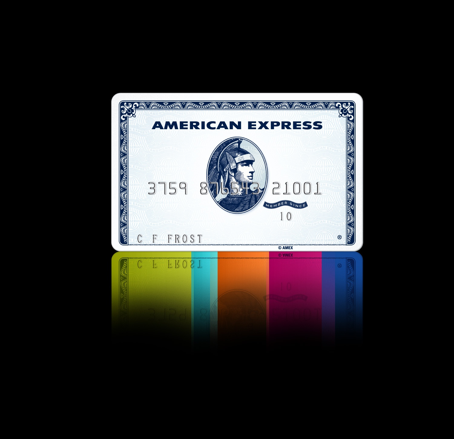
Through research, the team and I found that American Express introduced a “personalized credit card” targeting the millennial market in 2010. This credit card which launched towards the end of the financial crisis started with an annual fee of $25 and focused on targeting millennials looking for access to credit cards that would provide them “packs”. "Packs" were perks specific to their interests for example: volunteer service, travel, music, shopping, and restaurants. These individual packs cost an additional $5- $25 per pack and allowed consumers to create a fully customizable card.
While this card was discontinued due to competition with more competitive issuers it served as a valuable reference in validating the idea. Millennials do look for products that allow flexibility in the way they accumulate and spend credit card points and perk preferences are influenced by interests for this specific consumer segment.
While this card was discontinued due to competition with more competitive issuers it served as a valuable reference in validating the idea. Millennials do look for products that allow flexibility in the way they accumulate and spend credit card points and perk preferences are influenced by interests for this specific consumer segment.
Pivoting Our Strategy: Streamlined Application Process
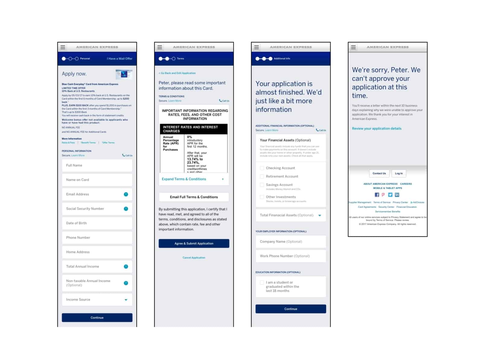
I documented the credit card application experience across multiple competitors. What did this experience look like when an applicant wasn’t approved? How were questions within the form fields structured? Were questions a long form list, or were they broken into steps? I was able to discover variations either first hand or through documentation in products across Chase, Bank of America, and American Express. I discovered that the process of discovering and applying for credit cards overlaps in many ways with the sales funnel.
Would Chatbots Resonate With Testing Participants
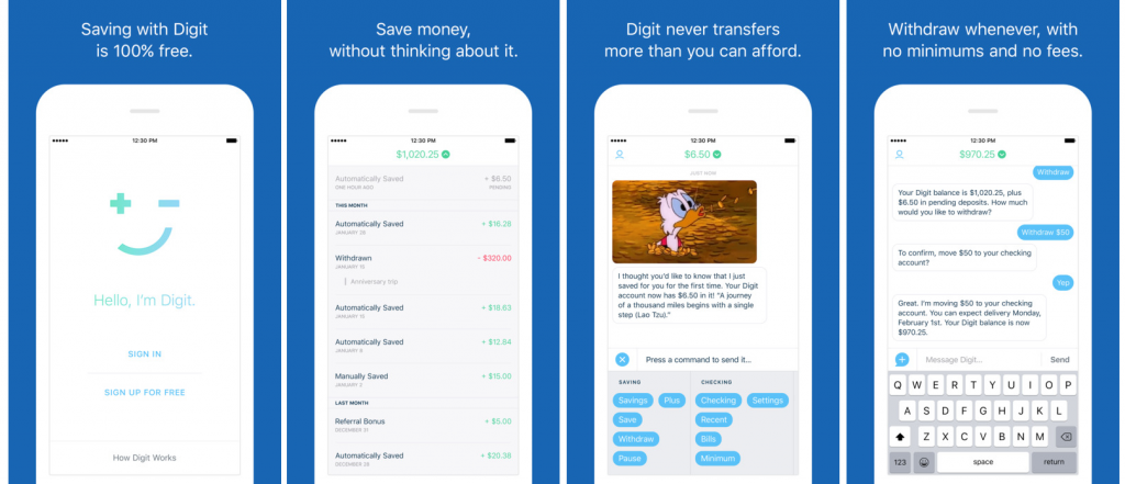
The team and I conducted a rapid competitive analysis of startups in the financial space solving problems targeted specifically at millennials. The use of chatbots on tools like Digit were incentivizing. For example, the AI in Digit was personalized and non-invasive all while handling sensitive personal details and banking information.
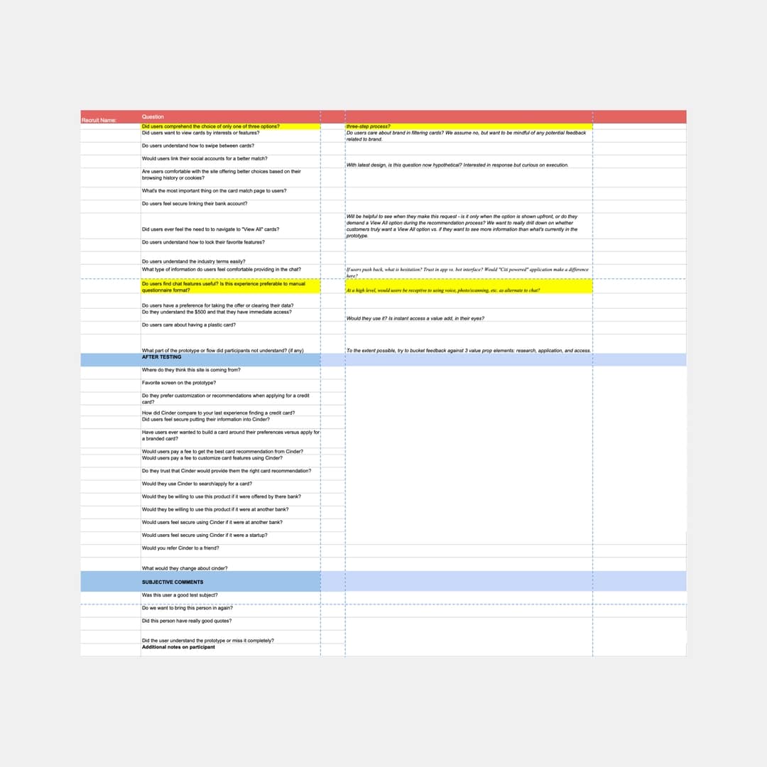
The average credit card application has 20 form fields that have to be completed. We wanted to test the impact of chatbots on the user experience with research participants. Alongside another UX designer, I completed wireframes across various parts of the flow. In addition to design, I worked with researchers to create a script and synthesize research findings in lab based usability testing.
Conversations in the design process that emerged were specific to how friendly/monotone the voice should feel, and what would be the most essential information for people to see in testing to understand that they weren’t speaking to a representative but instead an automated technology. In testing the chatbot, we wanted to understand if research participants would leverage it during the application process and how personalized the AI should feel.
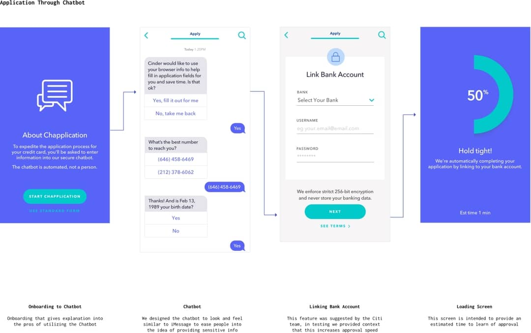
The Time Saving Benefits Of Linking Bank Accounts
In client workshops we discovered that credit card issuers need to verify the identity, credit score, and personal details of an applicant on the backend before they could display any information regarding an approval. This insight explained the long waiting time applicants experience after hitting the submission button. For user testing we surfaced linking a bank account in the beginning and towards the end of the flow to gauge how people felt about entering sensitive information on a product that was new to them.
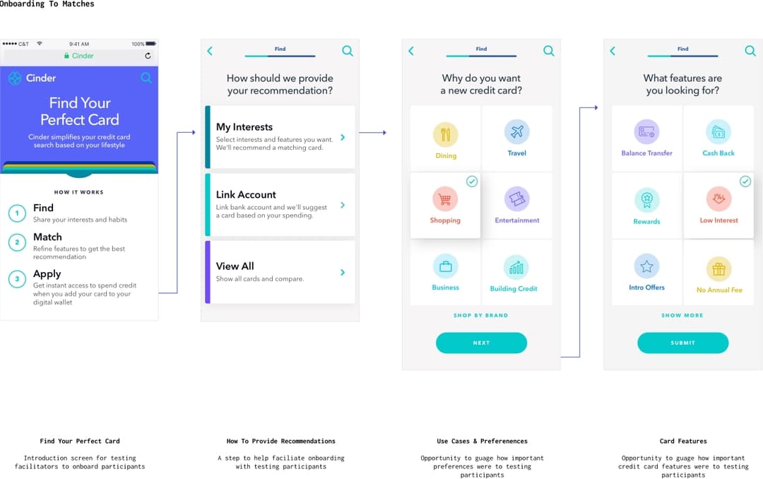
Interests Vs. Features Within The Onboarding
The idea of personalization was becoming more prevalent in the apps designed within the incubator, the team and I leveraged a design style utilized in another Citibank app to clearly showcase interests vs. features. In user testing we wanted to gain understanding of these categories and if they were as relevant to card applicants today as they were in 2010 with the American Express Zync card.
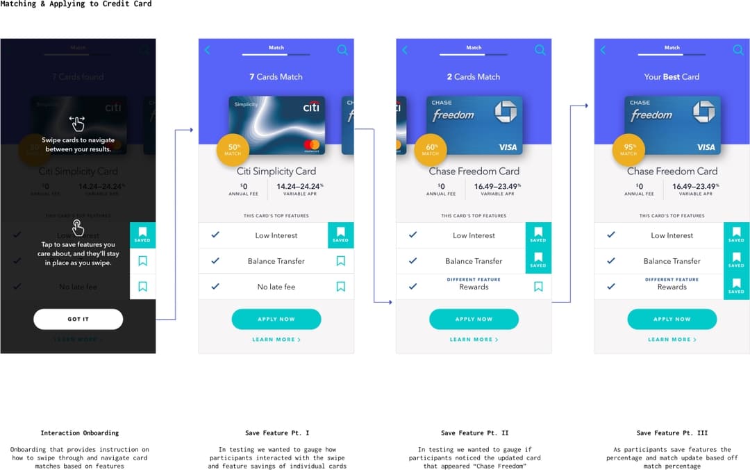
Using Interaction Design To Save Credit Card Features
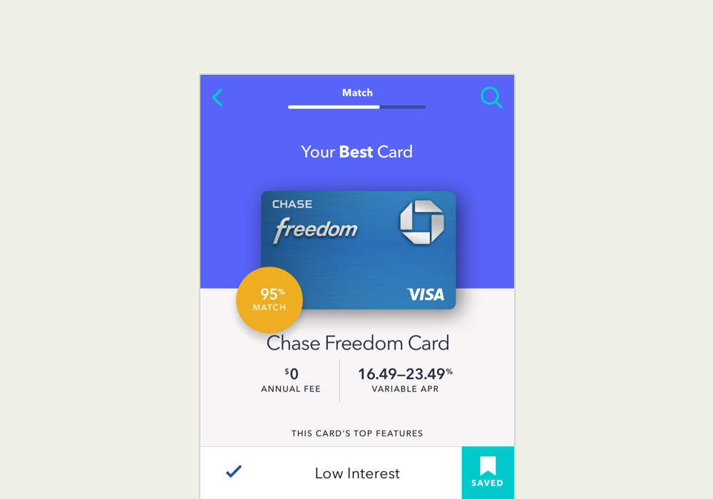
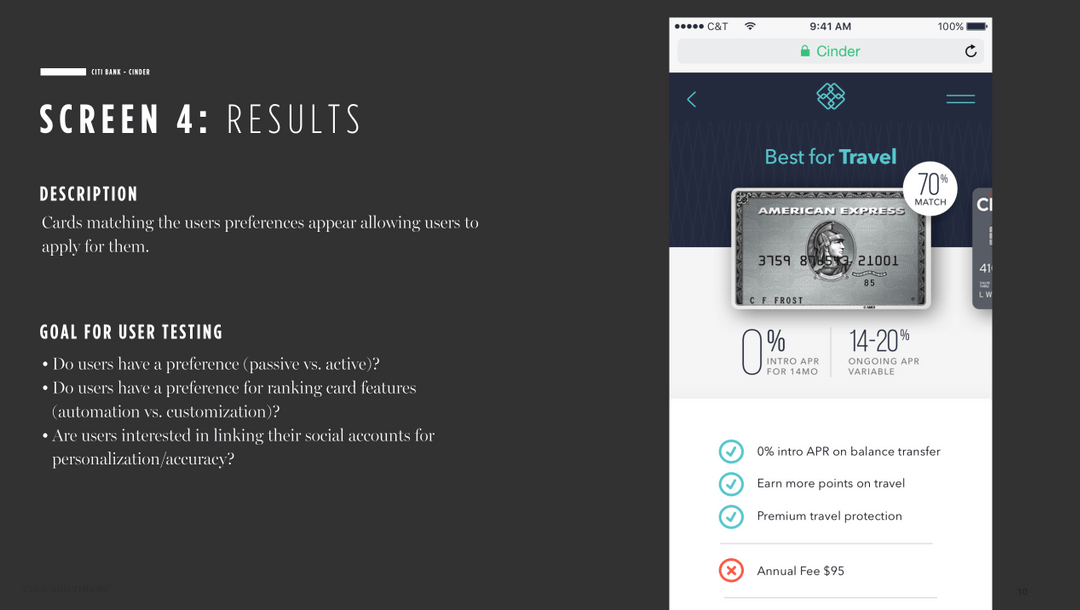
The idea to leverage swipe and tap interactions to reduce the amount of time spent browsing was pulled from an idea to introduce gamification to the filters that often exist within credit card marketplaces. Instead of using tappable category titles we wanted to test how people would react to the idea of locking in card features they liked while swiping for cards with features specific to their interests.
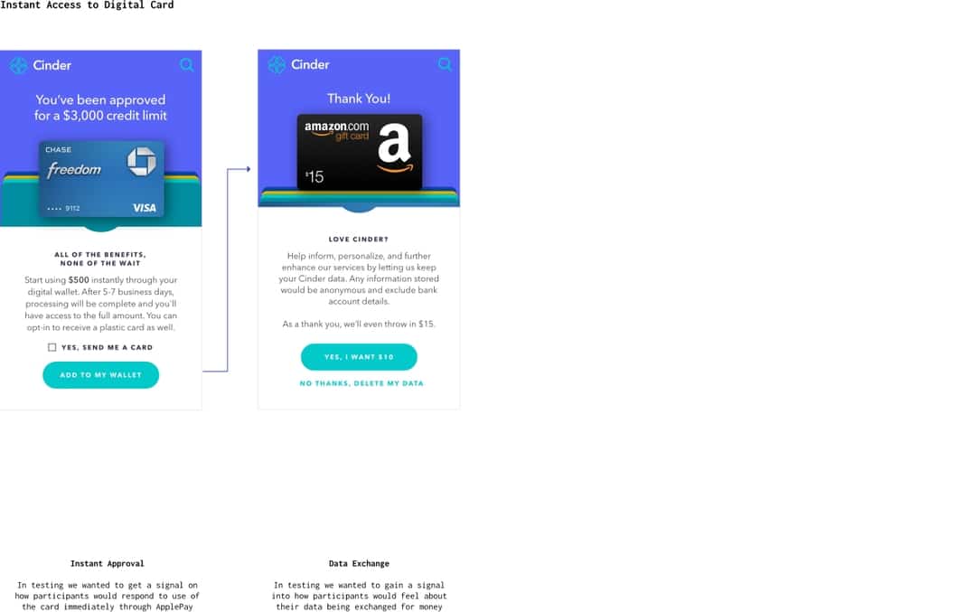
Apple Pay Access To Credit Card
Access to a credit card immediately is something that is currently available on select Citi cards and through a handful of other credit card issuers. The wait time to receive a new card can be extremely frustrating, and we wanted to gain insight into how this feature would perform with testing participants. I designed this screen to be easy to scan and to leverage content that would drive adding the card to a digital wallet.
Asking To Store Data
With such sensitive data the team and I felt it would be important to build the marketplace around personalization specific to data. For testing, I designed a content focused mockup to gain access to this data in exchange for monetary value.
Translating An Outline Into A Research Script
I worked with researchers to translate a rough outline into a research script to guide 8 participants through 1-hour research sessions. While questions at the beginning of the script were focused on being open-ended, several of the questions were written to identify behaviors and to understand how millennial credit card users felt about the personalization of the process.
- How many credit cards do you currently have?
- How do you currently search and apply for credit cards?
- Tell us about the cards that you currently have and why you selected them?
- Can you describe how you felt when you saw the chatbot?
- How did you feel about providing such sensitive information to a bot?
- How did you feel when you saw the immediate access of your card via Apple Pay?
- Would you still want a physical card?
- How do you feel about providing your data in exchange for a gift card?
- What type of company do you think would create a product like this?
- Would you use a product like this? If no, tell us more about why?
We tested this prototype in an Invision Prototype within a professional lab research facility. Behind a two-way mirror, I documented the findings and synthesized the larger takeaways from the research sessions. The testing environment was incredibly helpful and I was able to document findings alongside the client. During each testing session, we witnessed how testing participants resonated with the product; they were very eager to use the product once launched.
What We Learned From Testing
This product signaled extremely well with our millennial testing participants. We learned an incredible amount on the day of testing, and as a team, we were really impressed with the way the product performed.
Testing participants quickly picked up the interactions for selecting a credit card based on their preferences. They asked for more variability in the cards shown, in addition to the ability to view all the cards that were available to them in the marketplace. This was in case they wanted to browse everything, or specifically if they had an idea of a card they wanted and simply wanted to apply through the website.
The language used in the chatbot was slightly strange to some testing participants, they often felt that it was too simplified. Additionally, they suggested visualization of the interactions, specifically with motion, so that they could distinguish that the chatbot was AI more quickly. However, they were not deterred from using the chatbot despite it not being a customer service representative.
There was an even split in the number of people who would and would not provide their data in exchange for an Amazon gift card. Testing participants often associated this exchange with the personal setup for Apple devices, where in exchange for data, developers improve the product. We shifted the language of the screen to be similar to that used by Apple and in our final documentation proposed that this be a potential question added to the sign up flow when registration was designed out in more detail.