Citi Ventures, Easy 2 Decide
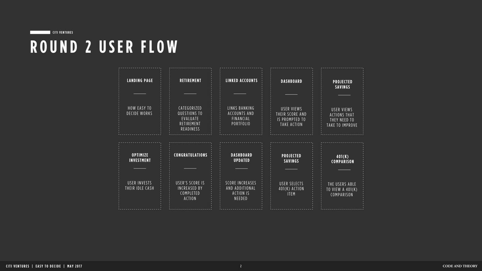
Citibank came to Code & Theory to create an incubator where rapid strategy and design could create prototypes for testing. Citibank stakeholders wanted to take advantage of emerging markets being captured by young start-ups. Through research, strategy, design, and synthesized findings teams at Code & Theory presented Citibank stakeholders roadmaps to MVPs and products that possessed viability in the market.
My impact included product strategy, product design and user research across four different financial products Easy2Decide, Cinder, Boss, & String. Each app had a different target audience, which existed across business or consumer audiences, and had age ranges between 18-54.
My impact included product strategy, product design and user research across four different financial products Easy2Decide, Cinder, Boss, & String. Each app had a different target audience, which existed across business or consumer audiences, and had age ranges between 18-54.
2017
Finance / 401K Planning
Product Strategy, Product Design & Discovery, Content Strategy
Designing A Future Focused Experience
Preparing people for retirement takes time, careful planning, and consideration. Many aging adults find themselves in the precarious position of planning for retirement while providing financial support to adult children and grandchildren. The financial responsibilities of today are balanced against planning for the unforeseen challenges of retirement such as medical bills, whether someone will have to continue paying a mortgage, the cost of health insurance, and property taxes.
There are positive life events to consider as well such as taking dream vacations, potentially moving to a new city, and visiting grandchildren. Planning for retirement is complex. The burden of preparation often overwhelms people as they get closer to the age of retirement.
Easy 2 Decide addressed the pain points of preparing for the unknown and unexpected costs of retirement. It was designed for people between the ages of 50-65 who actively contributed to their retirement savings and wanted options to maximize their annual contribution.
Building Collaboration Into The Design Process
Sketch sessions were run to gain a sense of how the client’s first hand knowledge, expertise and internal data would inform the design process. In addition to exploring features, whether to design for mobile, web or mobile web was considered. Through the sessions, we determined that fitness apps would be an ideal reference for a company outside of the financial space. We, also determined that gamification could be an interesting concept to expand on within the design system.
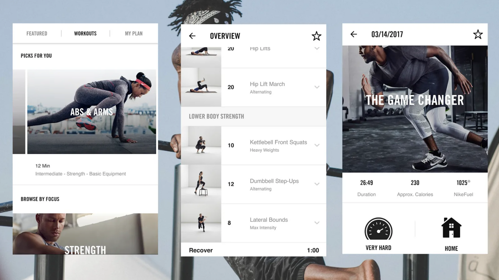
The client indicated a desire to breakdown the complexities of retirement planning into achievable and goal oriented steps. The gamification that exists within fitness apps often focuses on breaking down larger goals into smaller more achievable milestones that build strength over time. The pain points of the planning process for future events often stem from not knowing where to begin, and often not feeling sure if progress has been made.
By referencing fitness and it’s ability to build results over time, I researched topics that would educate our testing participants and created a way for them to understand how to quickly achieve goals in order to improve their financial wellness and readiness for retirement.
By referencing fitness and it’s ability to build results over time, I researched topics that would educate our testing participants and created a way for them to understand how to quickly achieve goals in order to improve their financial wellness and readiness for retirement.
Gamification Through Action Planning
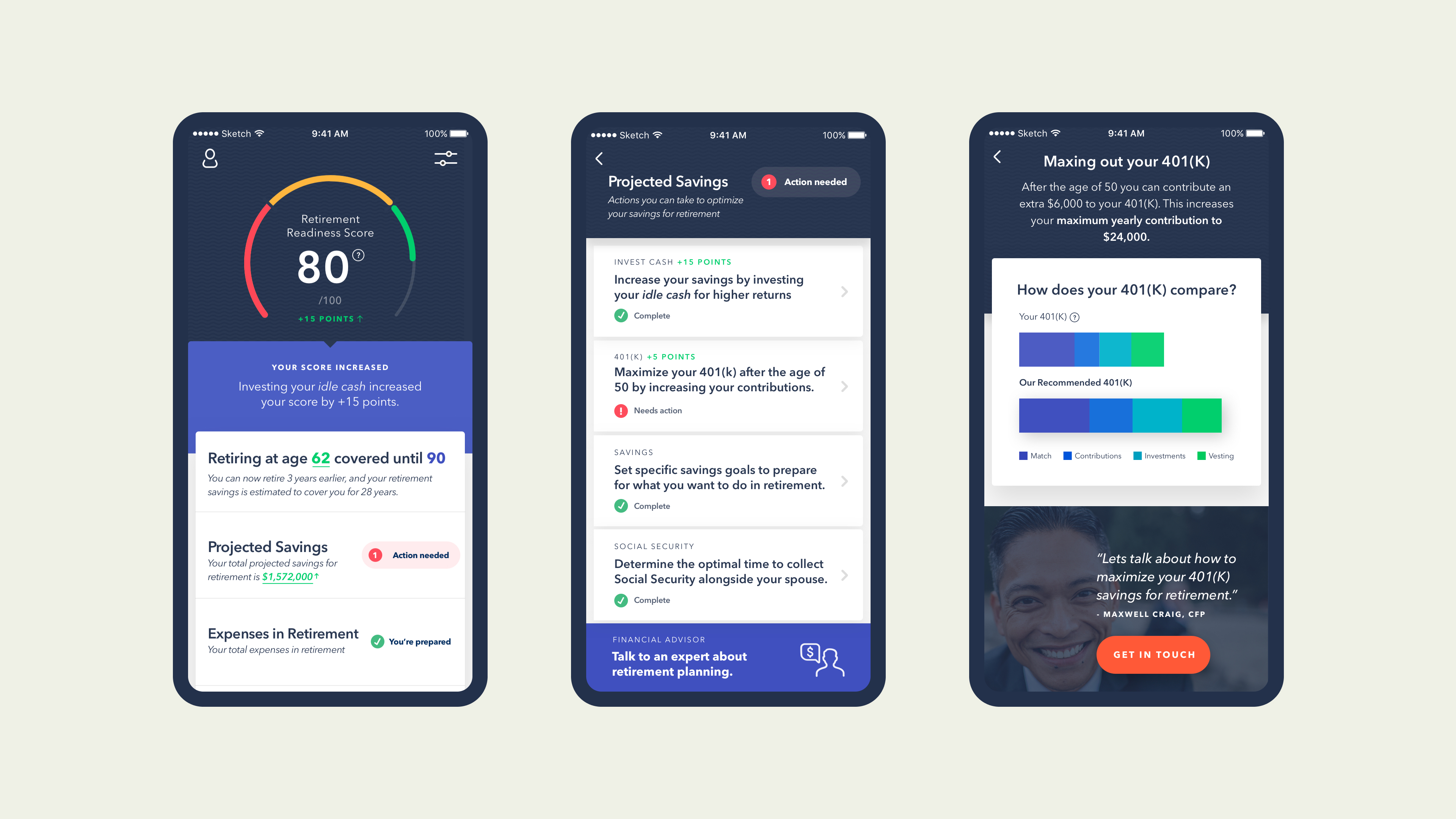
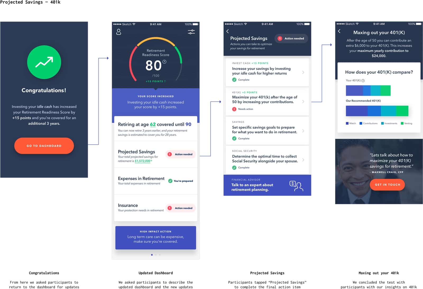
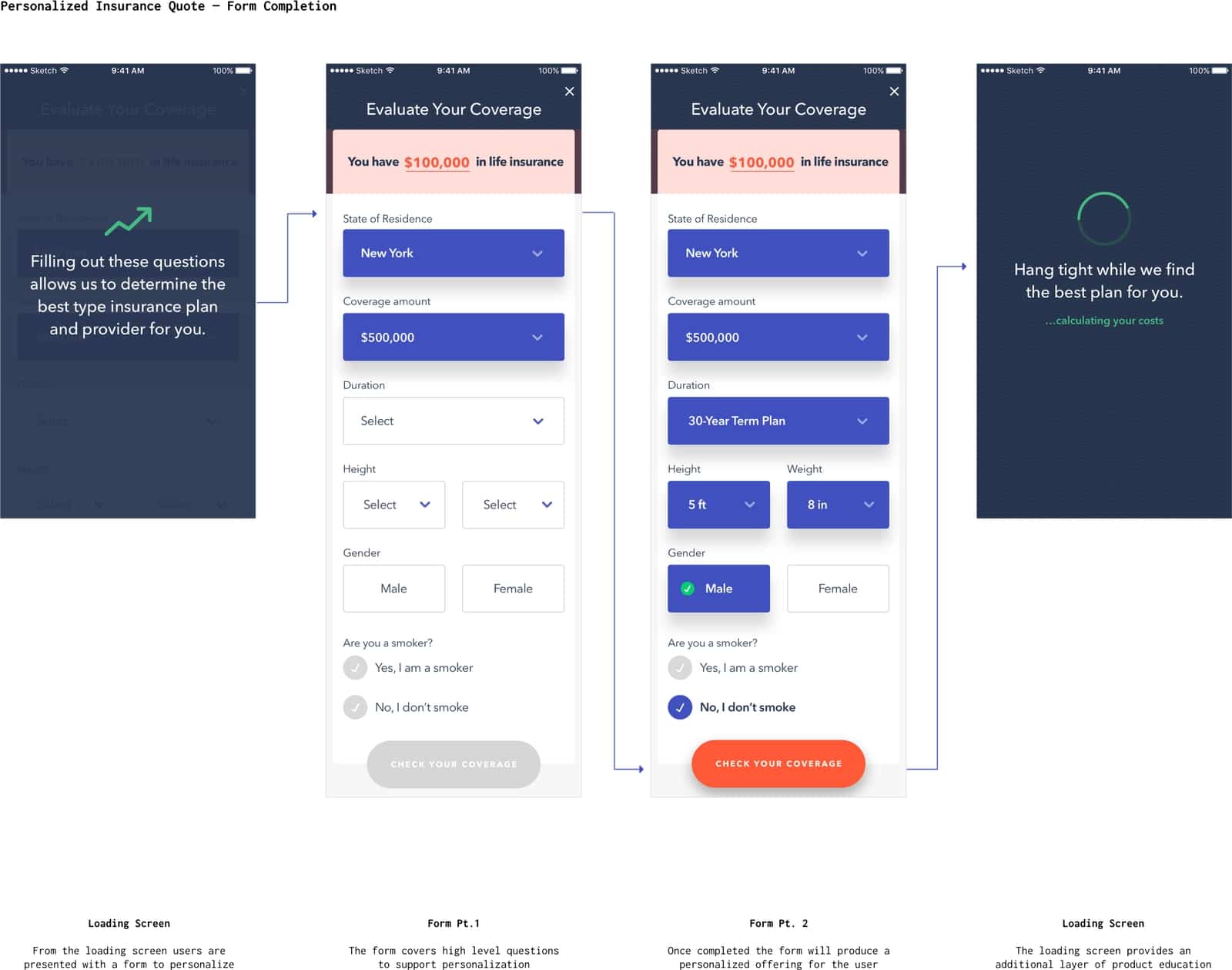
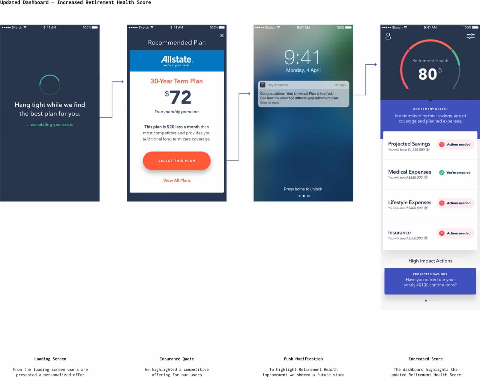
We introduced gamification through checklists that guided test participants through action planning. Through research, I discovered that after the age of 50 it is possible to increase the amount of money you can contribute to your 401(k). I designed the action list to breakdown information into 3 different buckets — an insight that could give perspective on improvement, a visualization of how a user compares to a visualization of the recommended 401(k)savings, and a connection to a Citibank product which could be a handoff to a financial advisor.
In workshops, we developed an early understanding that Citibank wanted to incorporate their existing and developing financial products. While the apps we designed would be branded as independent financial products, Citibank planned to maximize their earning potential with the incorporation of banking products.
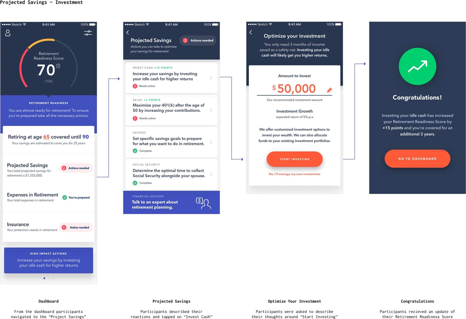
While the action plans worked to motivate people towards accomplishing large and small goals, it was important to showcase achievements in a way that allowed people to distill meaningful information about their retirement future. The dashboard was designed to visualize how prepared people were for retirement alongside insight into how long their savings would last based off projected expenses.
The visualization of data on the dashboard served multiple roles — a place for people to see where they stand for retirement, a checklist of actions they need to take versus what they have completed, and an overall gut check for whether they were on the right path. The achievement of each milestone was celebrated with points that populated the dashboard to encourage users to complete the action list.
In workshops, we developed an early understanding that Citibank wanted to incorporate their existing and developing financial products. While the apps we designed would be branded as independent financial products, Citibank planned to maximize their earning potential with the incorporation of banking products.
While the action plans worked to motivate people towards accomplishing large and small goals, it was important to showcase achievements in a way that allowed people to distill meaningful information about their retirement future. The dashboard was designed to visualize how prepared people were for retirement alongside insight into how long their savings would last based off projected expenses.
The visualization of data on the dashboard served multiple roles — a place for people to see where they stand for retirement, a checklist of actions they need to take versus what they have completed, and an overall gut check for whether they were on the right path. The achievement of each milestone was celebrated with points that populated the dashboard to encourage users to complete the action list.

Preparation For Lab Research
Research sessions were led at a professional lab facility, this provided us a space to house the larger team including Citi stakeholders and the product team that consisted of design, research, and production. This environment created a sense of collaboration where we could observe how participants engaged with the product as a team and internalize feedback from participants.
In discussions and design critiques, we realized we needed to understand how legible the visualization of information was and needed to determine the overall sentiment of having so much complexity on a single screen.
I worked with user researchers to create a list of testing questions for participant testing. Each script was designed to encourage people through guided questions where they could contextualize the current pain points of the retirement planning process alongside walking through each screen on the app. These interactions were all captured on camera where a participant would walk through the app where we, the larger team, could gain a sense of how the app signaled at different stages of the design.
Examples Of Guided Questions:
We incorporated general testing questions specific to our participants, for example, discussion of their professional careers and what they did for a living, their sentiments about retirement, and how they felt about their future.
Alongside our prototype, we guided people through a series of questions targeted at testing features:
- Can you talk to us about your retirement savings?
- What does success look like for you in retirement?
- How much do you contribute to your retirement savings?
- Would seeing a score be helpful to help you understand how you are tracking?
- Do these tasks/expenses align with the expenses you have considered in retirement, are there any you don’t see that should be here?
What We Learned From User Testing
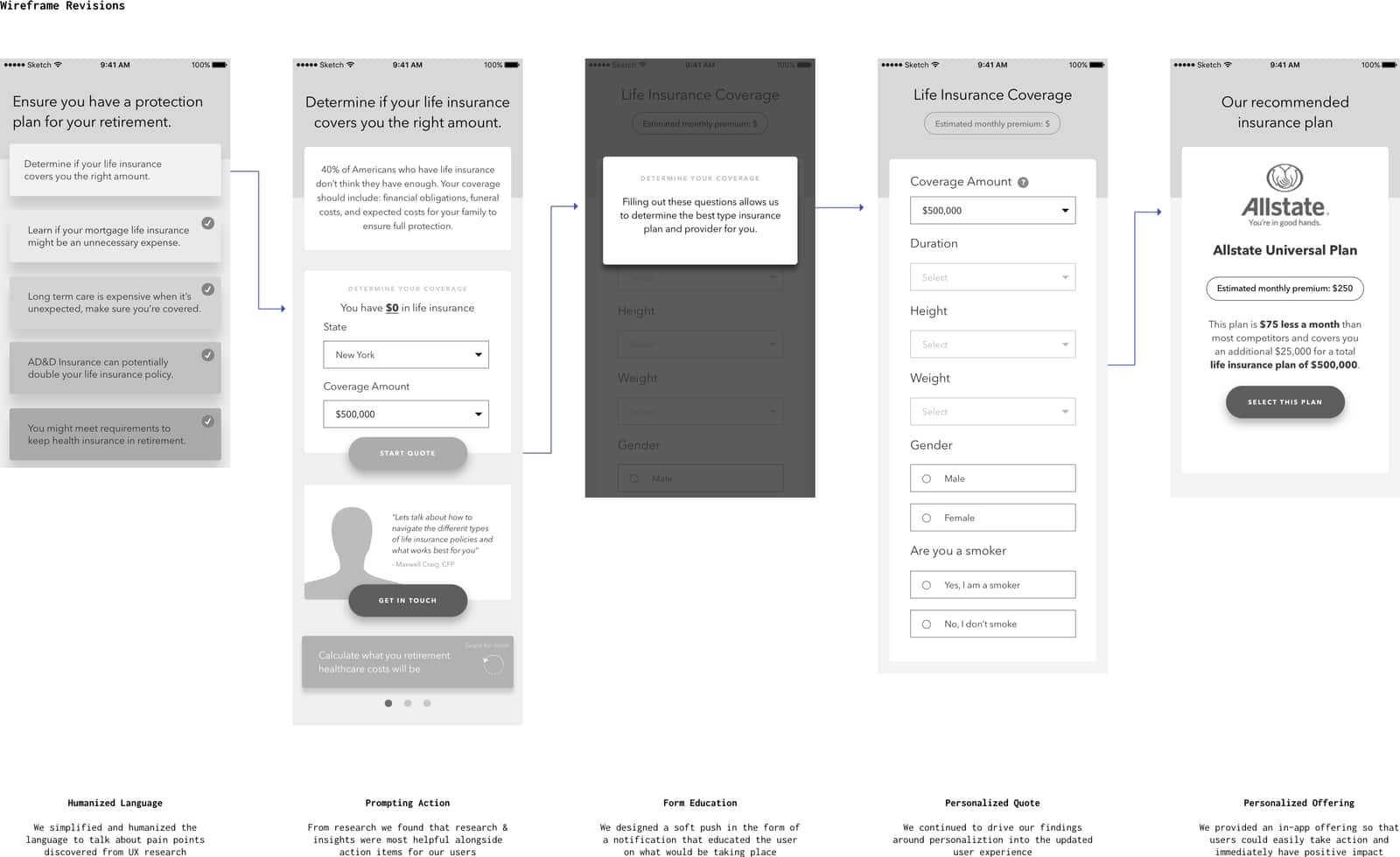
Through research sessions, we discovered that participants were overwhelmed by the amount of information shown to them on the dashboard. People lacked understanding about the retirement readiness score, participants had trouble defining and interpreting what the visualization represented and in several cases, people were overwhelmed when viewing how long their projected savings would last.
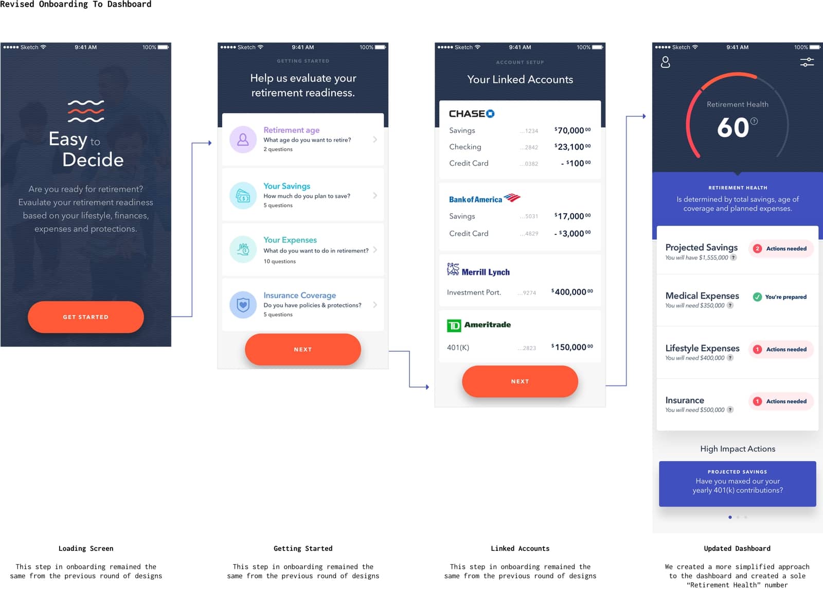
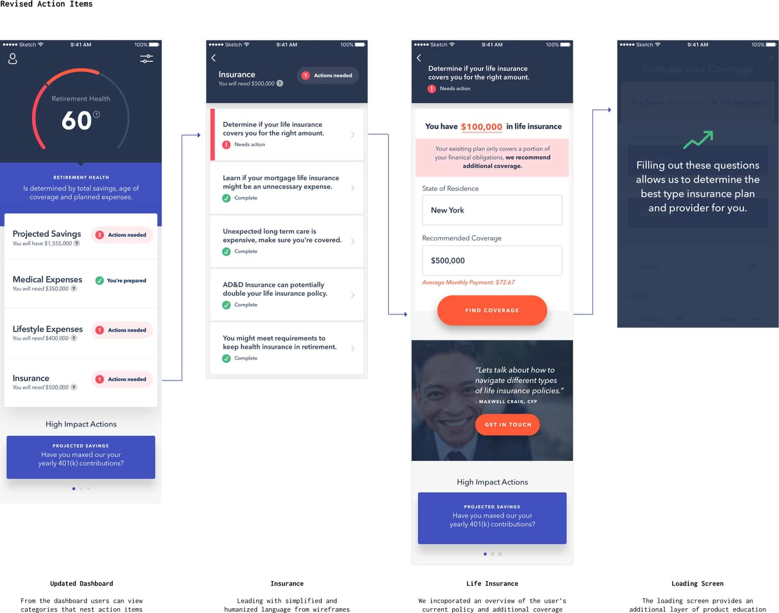
In order to create an improved dashboard we worked on reducing the amount of information on both the visualization and the the listed action plans. We pivoted the visualization of the dashboard to focus on retirement health and reduced the amount of information shown at the highest level of the action items. We also worked on pivoting the language within action items, instead, I designed cards that utilized language that proactively directed people to cost savings and planning for their future.
In order to create an improved dashboard we worked on reducing the amount of information on both the visualization and the the listed action plans. We pivoted the visualization of the dashboard to focus on retirement health and reduced the amount of information shown at the highest level of the action items. We also worked on pivoting the language within action items, instead, I designed cards that utilized language that proactively directed people to cost savings and planning for their future.